
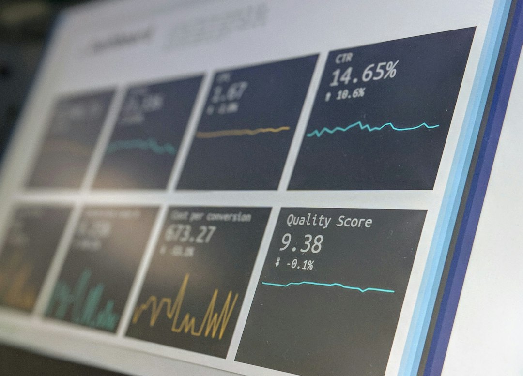
Dashboard ui design: 7 Rules for Clear Business Decisions
Dashboard ui design gives business teams a practical way to turn important information into reliable action. A manager sees 37 overdue jobs but needs to know which technician owns each one and why it remains open. The difference between a useful process and a confusing one is often a clear data definition, a named owner, and a tested way to deal with exceptions.
In this guide, we examine seven specific decisions or controls, the data each requires, and realistic ways to test them. We also cover business software design, common mistakes, and how to measure improvement. The goal is a process that staff can explain, use, and audit.
Write down what success looks like before introducing automation. Test the original business scenario, including corrections and missing data, rather than judging software by a polished demonstration.
What dashboard ui design means for business operations
Start by identifying the event that begins the process. Who notices it? What evidence exists? What should happen next? For many companies, that information lives in an inbox, worksheet, or separate application. However, when responsibility changes hands, the evidence can become difficult to find.
A structured process keeps the original reference, current status, and the reason for each decision together. It should also protect important values from accidental edits. For example, consider the following situation: A manager sees 37 overdue jobs but needs to know which technician owns each one and why it remains open. The team must be able to reproduce the result from the underlying records.
Before choosing a tool, agree on the owner for every important field. This helps prevent a situation where two systems show different answers and neither team knows which one controls the final outcome.
1. Define the decision
Core requirement. Dashboard ui design depends on a clear approach to define the decision. Start with manager question and action. Define what it means, when the value becomes available, and who may update it. Then identify the decision that moves the work forward. An ambiguous input can undermine every later report.
Why this matters. A common failure is to assume that one status tells the whole story. In practice, staff may need both a status and the original evidence. When define the decision changes, the system should preserve enough history to explain what happened. As a result, employees can distinguish a valid correction from a missing or duplicated event.
Practical example. Imagine that the team finishes accessibility tests, but the next employee discovers a problem with manager question and action. The person responsible for define the decision should be able to inspect the original record, add a correction reason, and send the case to an authorized reviewer. After approval, the task can continue toward metric ownership. Otherwise, the error may travel silently through later stages.
Implementation detail. Use a stable ID and a concise set of required fields. Display the responsible person and the last update time. Also document the difference between pending, rejected, and completed work so staff do not interpret the same label differently. Make sure the input reflects the way employees actually perform the task, not the idealized steps in a diagram.
Acceptance check. Test an ordinary record, an incomplete record, and a repeated submission. Review the resulting report and export, not just the screen. Ask a colleague who did not configure the tool to complete the test. If they need a private spreadsheet or extra verbal instructions, improve the workflow before deployment.
2. Metric ownership
Core requirement. Dashboard ui design depends on a clear approach to metric ownership. Start with formula source and owner. Define what it means, when the value becomes available, and who may update it. Then identify the decision that moves the work forward. An ambiguous input can undermine every later report.
Why this matters. A common failure is to assume that one status tells the whole story. In practice, staff may need both a status and the original evidence. When metric ownership changes, the system should preserve enough history to explain what happened. As a result, employees can distinguish a valid correction from a missing or duplicated event.
Practical example. Imagine that the team finishes define the decision, but the next employee discovers a problem with formula source and owner. The person responsible for metric ownership should be able to inspect the original record, add a correction reason, and send the case to an authorized reviewer. After approval, the task can continue toward priority summary. Otherwise, the error may travel silently through later stages.
Implementation detail. Use a stable ID and a concise set of required fields. Display the responsible person and the last update time. Also document the difference between pending, rejected, and completed work so staff do not interpret the same label differently. Ask the person receiving the handoff what information they need, because a completed form is not necessarily a usable result.
Acceptance check. Test an ordinary record, an incomplete record, and a repeated submission. Review the resulting report and export, not just the screen. Ask a colleague who did not configure the tool to complete the test. If they need a private spreadsheet or extra verbal instructions, improve the workflow before deployment.
3. Priority summary
Core requirement. Dashboard ui design depends on a clear approach to priority summary. Start with key figures and period. Define what it means, when the value becomes available, and who may update it. Then identify the decision that moves the work forward. An ambiguous input can undermine every later report.
Why this matters. A common failure is to assume that one status tells the whole story. In practice, staff may need both a status and the original evidence. When priority summary changes, the system should preserve enough history to explain what happened. As a result, employees can distinguish a valid correction from a missing or duplicated event.
Practical example. Imagine that the team finishes metric ownership, but the next employee discovers a problem with key figures and period. The person responsible for priority summary should be able to inspect the original record, add a correction reason, and send the case to an authorized reviewer. After approval, the task can continue toward trend comparison. Otherwise, the error may travel silently through later stages.
Implementation detail. Use a stable ID and a concise set of required fields. Display the responsible person and the last update time. Also document the difference between pending, rejected, and completed work so staff do not interpret the same label differently. Prefer an explicit reason for exceptional changes instead of silently overwriting the old value.
Acceptance check. Test an ordinary record, an incomplete record, and a repeated submission. Review the resulting report and export, not just the screen. Ask a colleague who did not configure the tool to complete the test. If they need a private spreadsheet or extra verbal instructions, improve the workflow before deployment.
4. Trend comparison
Core requirement. Dashboard ui design depends on a clear approach to trend comparison. Start with baseline and target. Define what it means, when the value becomes available, and who may update it. Then identify the decision that moves the work forward. An ambiguous input can undermine every later report.
Why this matters. A common failure is to assume that one status tells the whole story. In practice, staff may need both a status and the original evidence. When trend comparison changes, the system should preserve enough history to explain what happened. As a result, employees can distinguish a valid correction from a missing or duplicated event.
Practical example. Imagine that the team finishes priority summary, but the next employee discovers a problem with baseline and target. The person responsible for trend comparison should be able to inspect the original record, add a correction reason, and send the case to an authorized reviewer. After approval, the task can continue toward record drilldown. Otherwise, the error may travel silently through later stages.
Implementation detail. Use a stable ID and a concise set of required fields. Display the responsible person and the last update time. Also document the difference between pending, rejected, and completed work so staff do not interpret the same label differently. Use sample records from two different teams to reveal differences in local practice.
Acceptance check. Test an ordinary record, an incomplete record, and a repeated submission. Review the resulting report and export, not just the screen. Ask a colleague who did not configure the tool to complete the test. If they need a private spreadsheet or extra verbal instructions, improve the workflow before deployment.
5. Record drilldown
Core requirement. Dashboard ui design depends on a clear approach to record drilldown. Start with filter and underlying record. Define what it means, when the value becomes available, and who may update it. Then identify the decision that moves the work forward. An ambiguous input can undermine every later report.
Why this matters. A common failure is to assume that one status tells the whole story. In practice, staff may need both a status and the original evidence. When record drilldown changes, the system should preserve enough history to explain what happened. As a result, employees can distinguish a valid correction from a missing or duplicated event.
Practical example. Imagine that the team finishes trend comparison, but the next employee discovers a problem with filter and underlying record. The person responsible for record drilldown should be able to inspect the original record, add a correction reason, and send the case to an authorized reviewer. After approval, the task can continue toward actionable alerts. Otherwise, the error may travel silently through later stages.
Implementation detail. Use a stable ID and a concise set of required fields. Display the responsible person and the last update time. Also document the difference between pending, rejected, and completed work so staff do not interpret the same label differently. Where possible, calculate values from trusted source records rather than accepting free-form totals.
Acceptance check. Test an ordinary record, an incomplete record, and a repeated submission. Review the resulting report and export, not just the screen. Ask a colleague who did not configure the tool to complete the test. If they need a private spreadsheet or extra verbal instructions, improve the workflow before deployment.
6. Actionable alerts
Core requirement. Dashboard ui design depends on a clear approach to actionable alerts. Start with threshold and escalation. Define what it means, when the value becomes available, and who may update it. Then identify the decision that moves the work forward. An ambiguous input can undermine every later report.
Why this matters. A common failure is to assume that one status tells the whole story. In practice, staff may need both a status and the original evidence. When actionable alerts changes, the system should preserve enough history to explain what happened. As a result, employees can distinguish a valid correction from a missing or duplicated event.
Practical example. Imagine that the team finishes record drilldown, but the next employee discovers a problem with threshold and escalation. The person responsible for actionable alerts should be able to inspect the original record, add a correction reason, and send the case to an authorized reviewer. After approval, the task can continue toward accessibility tests. Otherwise, the error may travel silently through later stages.
Implementation detail. Use a stable ID and a concise set of required fields. Display the responsible person and the last update time. Also document the difference between pending, rejected, and completed work so staff do not interpret the same label differently. Record who approved a decision and when it became effective, particularly when money or access is involved.
Acceptance check. Test an ordinary record, an incomplete record, and a repeated submission. Review the resulting report and export, not just the screen. Ask a colleague who did not configure the tool to complete the test. If they need a private spreadsheet or extra verbal instructions, improve the workflow before deployment.
7. Accessibility tests
Core requirement. Dashboard ui design depends on a clear approach to accessibility tests. Start with contrast mobile and keyboard use. Define what it means, when the value becomes available, and who may update it. Then identify the decision that moves the work forward. An ambiguous input can undermine every later report.
Why this matters. A common failure is to assume that one status tells the whole story. In practice, staff may need both a status and the original evidence. When accessibility tests changes, the system should preserve enough history to explain what happened. As a result, employees can distinguish a valid correction from a missing or duplicated event.
Practical example. Imagine that the team finishes actionable alerts, but the next employee discovers a problem with contrast mobile and keyboard use. The person responsible for accessibility tests should be able to inspect the original record, add a correction reason, and send the case to an authorized reviewer. After approval, the task can continue toward define the decision. Otherwise, the error may travel silently through later stages.
Implementation detail. Use a stable ID and a concise set of required fields. Display the responsible person and the last update time. Also document the difference between pending, rejected, and completed work so staff do not interpret the same label differently. Measure repeat problems by cause rather than treating every warning as an unrelated incident.
Acceptance check. Test an ordinary record, an incomplete record, and a repeated submission. Review the resulting report and export, not just the screen. Ask a colleague who did not configure the tool to complete the test. If they need a private spreadsheet or extra verbal instructions, improve the workflow before deployment.
How to choose the right tools
A spreadsheet can be enough for a small, predictable process. As volume grows, staff may struggle with simultaneous edits, permission controls, and tracking corrections. Off-the-shelf software can solve common needs quickly, but it may impose rules that do not fit every business. Custom systems allow tailored approvals and reports but also require maintenance and careful testing.
When assessing a product, request a demonstration using the real scenario from the introduction. Then ask to see how the tool handles a late correction, two users editing one record, and a failed integration. For related considerations, review this Anomoz article on connected business records and workflows. It may help clarify how the proposed feature fits into existing systems.
Controls, documentation, and risk
Good documentation makes the process repeatable. Record the definition of important fields and keep an approval history for significant changes. Where rules vary by location or organization, have the relevant specialist check them before automating a decision.
For further reading, refer to this authoritative reference relevant to the process and additional official or specialist guidance. The sources offer context, but companies still need to confirm which standards and legal obligations apply to their own circumstances.
Limit access to sensitive records. In addition, test how teams recover after an outage and whether exported files retain enough context to explain the result. A backup that no one has restored in a test does not establish a dependable recovery plan.
A practical rollout checklist
- Choose one business problem with measurable costs or delays.
- Describe the starting event, final outcome, and owners.
- Agree on field meanings and source-of-truth rules.
- Check sample records before migrating them.
- Test duplicates, missing information, and corrections.
- Give frontline employees realistic practice cases.
- Compare rework and completion times with the previous process.
- Resolve exceptions before scaling to more teams.
During the pilot, note each workaround and give it an owner. Do not dismiss the small problems that force people back into email. Those issues often determine whether the new process will remain useful over time.
Common mistakes to avoid
First, avoid copying an old spreadsheet into software without examining the underlying rule. Second, do not confuse activity with outcomes. More notifications and more logins are not proof of greater accuracy. Third, do not let exceptions disappear after someone closes a task. The reasons behind repeated corrections can reveal valuable opportunities for improvement.
Instead, measure the rate of accurate completion, time to resolve an exception, and how often staff repeat work. Review those figures with the people closest to the process, since they often know why a rule is difficult to follow.
Frequently Asked Questions
Where should we start with dashboard ui design?
Start with define the decision and agree on manager question and action. Test one complete real case before expanding the scope.
What is the most important information to track?
Keep a unique record, responsible owner, current status, relevant source values, and an audit trail of corrections.
Should we buy software or build it?
Compare existing tools against your essential requirements and unusual cases. Build only when the added flexibility justifies ongoing support and maintenance.
How do we know whether a rollout succeeded?
Compare data accuracy, rework, turnaround time, and unresolved exceptions against a documented baseline.
Conclusion
Dashboard ui design works best when the team trusts the information and knows exactly what to do next. Use the seven checks to test real records, make ownership explicit, and improve the process before scaling.